Navigation
Install the app
How to install the app on iOS
Follow along with the video below to see how to install our site as a web app on your home screen.
Note: This feature may not be available in some browsers.
More options
Style variation
You are using an out of date browser. It may not display this or other websites correctly.
You should upgrade or use an alternative browser.
You should upgrade or use an alternative browser.
Artwork
- Thread starter KenpoTess
- Start date
Simon Curran
2nd Black Belt
Me thinks me better get out me pencil and pad again, looking at all of these makes me feel inspired...
A couple more...
First one is called "Pillars of Cerce" another cave complilation.
Second one: "Whoops, wrong ledge." That isn't a rattle snake the caver encountered (and no it's not me either). It's a common rat snake or gopher snake. Their markings are very similar to prairie rattlers and they do vibrate their tails against whatever they're laying on to give that impression. A defense mechanism. They commonly fall inside pit entrances. Sometimes they live, sometimes they die. Sometimes they manage to get out, sometimes... they don't.
I've heard many stories of how cavers are confronted by snakes and how they're always rattlers. Well, you're climbing up a ledge in the dark and the only light you got is what's on your head and bam, your eye catches a quick movement and you turn to see what it is and bam you're face to face with a rattlesnake ready to sink it's fangs into you. You skedaddle on outta there quick so there's not a chance to really look and see. Thus the false impression which is exactly what this reptile's defenses are. Some people huh?
First one is called "Pillars of Cerce" another cave complilation.
Second one: "Whoops, wrong ledge." That isn't a rattle snake the caver encountered (and no it's not me either). It's a common rat snake or gopher snake. Their markings are very similar to prairie rattlers and they do vibrate their tails against whatever they're laying on to give that impression. A defense mechanism. They commonly fall inside pit entrances. Sometimes they live, sometimes they die. Sometimes they manage to get out, sometimes... they don't.
I've heard many stories of how cavers are confronted by snakes and how they're always rattlers. Well, you're climbing up a ledge in the dark and the only light you got is what's on your head and bam, your eye catches a quick movement and you turn to see what it is and bam you're face to face with a rattlesnake ready to sink it's fangs into you. You skedaddle on outta there quick so there's not a chance to really look and see. Thus the false impression which is exactly what this reptile's defenses are.
Attachments
Looking at all these great sketches has really given me the itch to start drawing again. I pulled out my sketch book and found some OLD, and I do mean OLD sketches. Some dating back into the early/mid '80's. I got married in '87 so.....
Anyway, here they are:
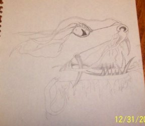
The first one is an unfinished dragon
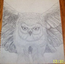
The second one is an owl (some of you may recognize it from the old Rush Fly by Night album cover )
)
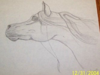
The third is an Arabian horse head
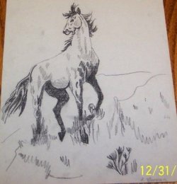
The fourth, another horse, different style
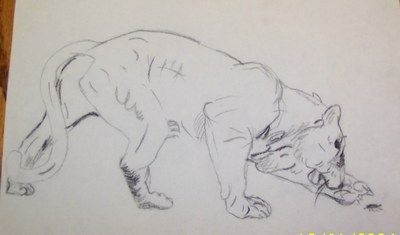
and the fifth a quick sketch of a lioness
I also like doing pointelism (sp?)
Now...I need to think of something new to draw...
Thanks for starting this thread Tess!
Anyway, here they are:
The first one is an unfinished dragon
The second one is an owl (some of you may recognize it from the old Rush Fly by Night album cover
The third is an Arabian horse head
The fourth, another horse, different style
and the fifth a quick sketch of a lioness
I also like doing pointelism (sp?)
Now...I need to think of something new to draw...
Thanks for starting this thread Tess!
Attachments
*BRAVO~!! Kudos to you Pamela, Ralph and Kroh~! *big happy smile to be amongst all this talent and wonderful people.. Pssssssssst John.. We all started out drawing stick figures.. just take it a step further and add another 'same' stick figure along side and voila.. you have added dimension.. (kinda sorta) G* *pats your head.. you're such a cool guy 
Pamela, I really like your owl.. I have a 'thing' for owls *G* Beautiful works~!!!
Ralph, now you're talking.. Love to see works that really come from the heart and soul of the artist.. mmmmmmhmms ~!
Kroh, You really have a wonderful talent and can see those as book illustrations~!
Pamela, I really like your owl.. I have a 'thing' for owls *G* Beautiful works~!!!
Ralph, now you're talking.. Love to see works that really come from the heart and soul of the artist.. mmmmmmhmms ~!
Kroh, You really have a wonderful talent and can see those as book illustrations~!
SLTL, since you asked. I have been through way too many critiques in school and through my professional life to not give my honest opinion. It doesn't help anyone to give anything other. There is a difference between constructive and destructive. I would never give the latter as you probably know already.
I really liked your owl. The detail in the wings is nice. You need the same amount of detail in the face --it looks unfinished. Contrast-black to white with medium tones. The owl face is mosly medium tones. Pull it out with black. Owls eyes are usually piercing, check them out with a reference.
Since I started with horses, my love as a child, I recognize good construction and above all else you definitely have a talent showing with the Arabian. (also my favorite breed) Same contrast, detail issues. Check anatomy books for horses for underlying bone, muscle structure. The eye is the most important on the Arabian. They have deep, strong eyes, not much white showing. Should have a highlight white if nothing else, but there are medium tones too. I love the Arabs that have alot of black around their eyes. I went to an Arabian farm earlier this year and wanted my sketchbook but had no time. I should go back as I was invited.
The Appaloosa. That's a great pose. The overall structure isn't in the right proportion. The underlying anatomy isn't correct. Don't worry ever about detail until you have that right. Legs even though they are in grass have to be indicated--the line carries through the grass. Each drawing has to have weight showing. Does it look like each leg/foot on the ground carries its share of the weight? Or does it look like it is in the air? If you don't put the black shadows in the right spot or get too heavy (belly) on the black it looks "cut".. too hard. The part of the horse closest to the viewer is lighter, a lighter border edge, the edge away is black, heavier. I used to copy alot of horse illustrators when I was a kid. Then I moved on to photos, then my own photos and then real life. Even though an Appy is spotted, their spots are sometimes muted by the light. Always remember the light. If alot of light, shadows are light like on the inside of a leg. If the source of the light is a bright light in a dark barn, there is severe shadows so detail is lost...somewhat like the Appy drawing. Seen during a thunderstorm, lightning the light source, would cast the horse in deep shadows, the white of their back also a medium gray. The direct part of their face hit by the brightness of the lightning only would be light. The details of the spots would be barely indicated.
The lioness is pretty good so far, again needs more work, detail, contrast, perhaps to show weight, grass underneath, with shadowing. What part is in the light? What do you want the eye to draw to first-her eye or to her cub if that was in the picture? Or to contract her to lush folliage of the surroundings? Is everything recognizable in the picture?
The best way to plan a drawing. Remember the whole page, use the white space, where is the focal point. Draw light to get proportion, then slowly build up lines. As you draw more, your line gets more sure in the stroke. Before it is detailed plan the light and the degree of shading. Sketch in shading lightly before details.
PS, I like realistic drawing as well. Tess's style is stylized which is fun too.
MACaver is realistic as well. If anyone else wants my comments, you will need to ask... as Tess and Pam has done. TW
Excellent Bob.Bob Hubbard said:This is probably my best piece to date.
http://www.rustaz.com/gallery/displayimage.php?album=17&pos=2
(Warning: some content is PG-13 in that gallery.)
-Michael
Thanks TW. I appreciate your feedback.
I always have to have something for reference when I draw. It's much easier for me to look at something and copy it. The arabian was the only thing posted that I drew without some sort of reference. (BTW - horses were my first love too. )
)
I did start drawing from photos but hadn't done much. Time for me to find to new pictures to draw from....
Thanks again.
:asian:
I always have to have something for reference when I draw. It's much easier for me to look at something and copy it. The arabian was the only thing posted that I drew without some sort of reference. (BTW - horses were my first love too.
I did start drawing from photos but hadn't done much. Time for me to find to new pictures to draw from....
Thanks again.
:asian:
Bob Hubbard said:This is probably my best piece to date.
http://www.rustaz.com/gallery/displayimage.php?album=17&pos=2
(Warning: some content is PG-13 in that gallery.)
Wow. VERY good work.
kenpo tiger
Senior Master
SLTL,
I loved the horses. That's probably the only thing I draw well, since it's all I drew as a little girl. Haven't done it in ages and would probably embarrass myself, so content looking at your good work! KT
I loved the horses. That's probably the only thing I draw well, since it's all I drew as a little girl. Haven't done it in ages and would probably embarrass myself, so content looking at your good work! KT
We got some serious talent here. Cool stuff! 
M
Mazarin
Guest
SLTL.....eeee! Ryoko's my favorite char from Tenchi. tis very nice work. :3
on the topic of sharing, just something i sketched out last month and never finished inking. it's Kinnazu sittin' with one of my griff characters.

on the topic of sharing, just something i sketched out last month and never finished inking. it's Kinnazu sittin' with one of my griff characters.

Cool, Mazarin! Hope to see it when it's finished.Mazarin said:on the topic of sharing, just something i sketched out last month and never finished inking. it's Kinnazu sittin' with one of my griff characters.

