Navigation
Install the app
How to install the app on iOS
Follow along with the video below to see how to install our site as a web app on your home screen.
Note: This feature may not be available in some browsers.
More options
You are using an out of date browser. It may not display this or other websites correctly.
You should upgrade or use an alternative browser.
You should upgrade or use an alternative browser.
Couple new shots.
- Thread starter Bob Hubbard
- Start date
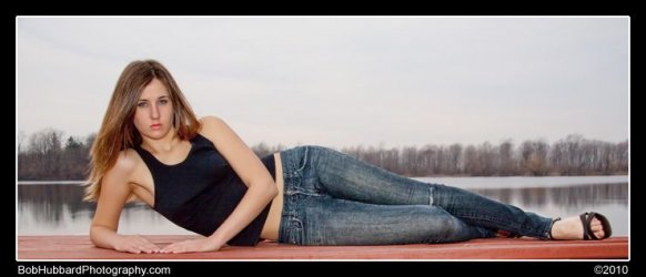
In the mostly full length shot of the girl with red hair... the blue pants kind of don't quite blend/don't quite clash enough with the background, in my opinion. Great pic, nice pose... but the legs kind of get lost.
SensibleManiac
Black Belt
- Joined
- Jun 6, 2007
- Messages
- 556
- Reaction score
- 14
I agree the pants should be changed, maybe red or black would work better.
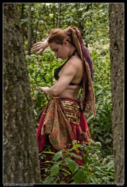
And the woman standing between the 2 trees would probably look better asthetically if she were just surrounded by greenery.
And the woman standing between the 2 trees would probably look better asthetically if she were just surrounded by greenery.
Agree here I think cropping would've helped the pic as well... difficult to do with this type of portrait. Wanting to show the pants (thus the need for a neutral back ground so not to clash) which are likely part of the model's personal wardrobe and personality but not cutting them off so much that she looks somewhat stunted. If it's ok with you Bob, I'll copy the pic and play with cropping on my own photo editor (Gimp) and post it here... :idunno: maybe I'll just mess it up or find something that makes me go Ah!In the mostly full length shot of the girl with red hair... the blue pants kind of don't quite blend/don't quite clash enough with the background, in my opinion. Great pic, nice pose... but the legs kind of get lost.
Of the three I liked this one best and I can see the intent to use the trees to frame the model and I do like it but think also using ONE tree on either side would've created a different (if not better image). Overall that is my fav of the three.I agree the pants should be changed, maybe red or black would work better.
And the woman standing between the 2 trees would probably look better asthetically if she were just surrounded by greenery.
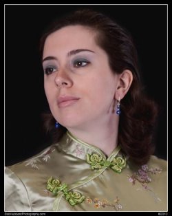
The gentleman's portrait felt too UP CLOSE ... maybe a foot or two further back would soften that effect.
Still good work Bob. :asian:
Edit: Whoops seems that I didn't let it completely load and didn't see the portrait of the woman... that is very good indeed. Even though it's roughly the same distance as the man the effect is different. Perhaps because she's not looking directly AT you or even the camera, there's also a softness felt by the lighting. If it were the same lighting then one can see the difference how it can affect one person or another.
I think your work is improving each time I see a new set of Pics.
- Thread Starter
- #6
Omar B
Senior Master
Love the one above. Of the top ones, the chick in the blue pants on the blue background does not work, change the pants or the background. The chick in the woods is amazing.
Ingeneral agreement with everyone. Nice shots, overall. The gentleman in the first photo seems a little overexposed inna face.
Peek-a-boo is excellent. Beautiful clarity in her eyes.
Peek-a-boo is excellent. Beautiful clarity in her eyes.
Aye, lovely shot that one, Bob. Also, I missed this when it was first posted so I hadn't seen the shots in the OP before.
The one of Mrs. Bob is beautiful. It emits a sense of regal, serene, confidence.
The gentleman is a little over-lit, highlighting his ruddiness.
As for the lass with the red hair, I think I concur with then comments of my fellows in that those blue trousers are a distraction rather than an addition. Also, that glasses half-off pose would be better if the shot gave a sense of motion, as if she were taking them off rather than looking over the top of them.
I get the idea of snapping the Celtic Druidess (aka Arabic Belly Dancer) through the trees but I think they need to be a bit further apart as their prescence in the foreground distracts the eye from the subject (beautiful tho she is).
Omar B
Senior Master
Yes, I see it Sukerin. The belly dancer chick's picture does seem a bit clustered. It's the tree in the fore that does it, the one on the right.
- Thread Starter
- #11
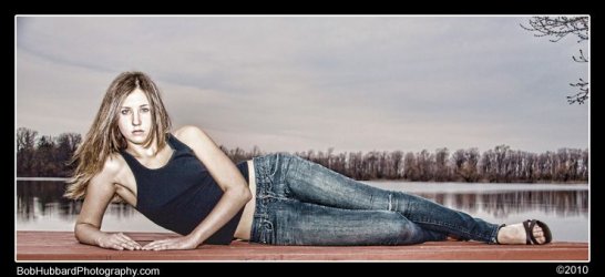
I like the processing on the last set - are you using photoshop actions? Is the second one a lower F stop or all editing after the fact? What lens are you shooting here?
I like the bottom one best... but neither pose is your best, and given the ones with the same model and the tree, you can do better. Were these maybe feeling out shots early in the session? They just feel very run-of-the-mill, routine poses... Almost yearbook/portfolio posing. And you often do a great job of actually connecting with the models, and bringing personality through the lens...
- Thread Starter
- #14
Combination of raw, tweaks on initial load, custom PS actions and scripting, and lots of close up tweaking (healing brush, dodge, burn and sharpen)
Camera on all 4 shots was the Canon 50D, lens the 18-200 IS, F5.6 iso 200, shutter 250
Camera on all 4 shots was the Canon 50D, lens the 18-200 IS, F5.6 iso 200, shutter 250
- Thread Starter
- #15
This was her first shoot ever, so she was a bit nervous and we hadn't had a chance to do my normal pre-shoot chat. I'd expected better lighting and ended up with heavy clouds creating very flat lighting. Towards the end of the shoot we ended up dealing with an army of mosquitoes, so wrapped early. The seated shot was early on, the 2 prone at the end of the shoot when my flash started to not cycle (note, always check you packed the spare batteries).I like the bottom one best... but neither pose is your best, and given the ones with the same model and the tree, you can do better. Were these maybe feeling out shots early in the session? They just feel very run-of-the-mill, routine poses... Almost yearbook/portfolio posing. And you often do a great job of actually connecting with the models, and bringing personality through the lens...
- Thread Starter
- #16
side note: the peek a boo shot is my and her favorite from this shoot. I think it's the best of the 60 shots in the series.
I can see why... Though the "tree hugger" shot is good, too!side note: the peek a boo shot is my and her favorite from this shoot. I think it's the best of the 60 shots in the series.
And you often do a great job of actually connecting with the models, and bringing personality through the lens...
I absolutely agree. It's something I've said before I think but it bears repeating that Bob certainly has that gift :tup:.
Also, the new model most definitely has a certain something of her own. From my reading of the shots, she can project either either warm vulnerability and innocence or self assured haughtiness {no, not hawt-iness ... tho' she most assuredly has that too :lol:... a certain Anna Kournikova look methinks?}
Combination of raw, tweaks on initial load, custom PS actions and scripting, and lots of close up tweaking (healing brush, dodge, burn and sharpen)
Camera on all 4 shots was the Canon 50D, lens the 18-200 IS, F5.6 iso 200, shutter 250
I like the shots! And btw, I just picked up one of those myself (the Canon 50D, not the hawt model. :lol
- Thread Starter
- #20
Similar threads
- Replies
- 4
- Views
- 1K
- Replies
- 21
- Views
- 3K
Latest Discussions
-
-
-
Aging, health issues and Martial Arts. - Martial Journal
- Latest: Kung Fu Wang
-
-


